London Illustration Fair 2015
Talented graphic designers and artists congregate to display their works

The graphic design and illustration scene in London is going from strength to strength at the moment, and part of the reason might be the British capital’s abundance of fairs where emerging talents can network and showcase their designs. The three-day The London Illustration Fair (which started in 2013) is much smaller than Pick Me Up London, but the artists and studios at the July edition, rallying to the theme of “Summer Festival: Psychedelia,” still impressed.

The sunny weather (not a given in notoriously rainy London) didn’t stop visitors from flocking to the venue, located underneath an old railway arch in Hoxton, where they were first met by Bread Collective’s “Beauty is an Illusion” design. Inside the space, a well-curated selection of artists and studios showed why illustration and graphic design is getting so much attention in the city right now: it was hard to pick a favorite exhibitor, as the general quality of the work was so high. Strolling among girls in Ghost World-style outfits and guys in cat-print shirts, we managed to narrow it down to the five stalls that we liked the most.

Material
Located in nearby Shoreditch, Material is an innovative design store and gallery that has been going since 2007. The selection of artists they work with is impressive; at LIF, Material showed prints by Neal Fox and Le Gun, among others, as well as postcards, stationery and books (including new products by popular kids’ illustrator Katja Spitzer). Co-founder Lucy Payne’s beautiful own-designed wrapping papers are a perfect example of the attention to detail that makes Material so good at what it does.
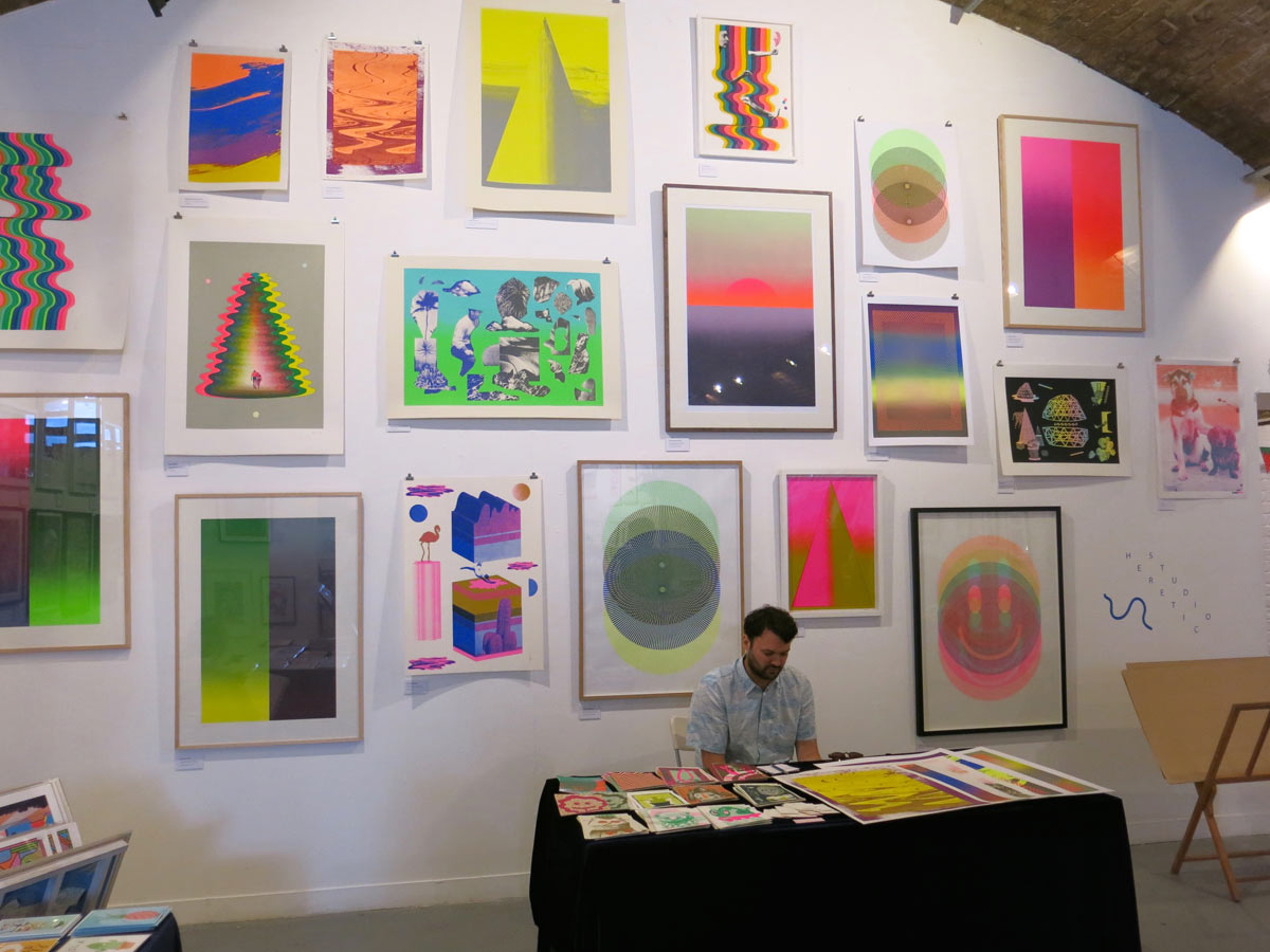
Studio Heretic
Studio Heretic’s prints took up the entire back wall of LIF, creating an impressive focus point that showed off how versatile the studio’s work is. The Summer Festival’s “Psychedelia” theme really suited Heretic’s trippy, color-saturated works, created by Luke Frost, Jon Rundall and Therese Vandling. The three designers have worked with Architectural Revue, Need Want Records and The Quietus, among others, and at LIF we admired their “Psych for Sore Eyes” 7” for the Sonic Cathedral record label.

Flabbydagger
“A shit zine for a shit world,” illustrators Charlie Mellors and Russell Taysom’s Flabbydagger harks back to the golden days of handmade zines. Even though the issues are risograph-printed by experts like Ditto Press, Flabbydagger has that old-school, run-up-on-a-photocopier feel, and the stories in the latest drugs-themed issue have a satisfyingly wacky DIY vibe. Flabbydagger also sold stickers, patches, and their attention-grabbing spliff-smoking pizza pin.

Yann Brien
French printmaker Yann Brien’s beautiful, graphic works use simple geometric shapes to great effect. His monochrome spirals and blocks were eye-catching, and the restrained color combinations made them stand out among the many multi-hued prints at LIF. The deceivingly simple designs were reminiscent of retro computer-generated graphics, and complemented Brien’s more figurative works nicely.
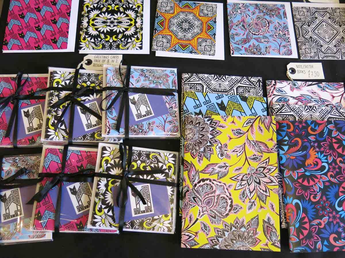
Print Bint
Former fashion designer Tara Khorzad has created pieces for such UK high street giants as Topshop and Miss Selfridge, but recently packed it in to start her Print Bint brand. And it’s easy to see why she felt ready to go at it on her own: her colorful flower and geometric prints looked great on both oversized scarves, clutches and notepads, and made for a fresh, young take on psychedelia.
Images by Cajsa Carlson


