Starbucks’ Vice President of Design + Content Jeffrey Fields Reveals Their Red Cup Design
Discussing global brand identity and how it morphs for changing seasons


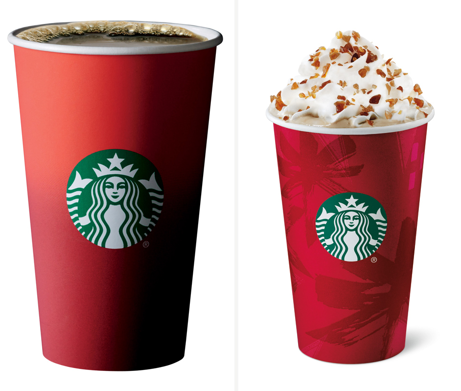
While coffee preferences vary and CH often prefers to consume local, indie coffee brands, Starbucks plays a critical role in global coffee adoption—and they aim to do so responsibly. Moreover, they’re one of only a handful of brands whose iconography has reached the world over. Since 1997, Starbucks has unveiled a holiday cup that’s become synonymous with seasonal change (we’ve chronicled their progression visually here, from the present day back through 2010). Today, they’ve revealed their latest red cup and we spoke with their Vice President of Design + Content, Jeffrey Fields, to get an understanding of its value and history. Each year, the cup aims to tell a story. This year, the cup invites consumers to share their own in many ways. It’s minimal, beautiful and will be sure to trigger something nostalgic and yet entirely new.
What’s the story behind the design of this cup?
We have been literal with the stories for our cups the past few years. It’s now such a special year that we are really trying to balance what we know Starbucks to be at the holiday time—this world coffee house and a place to meet and be with each other, and be that place of respite—with a place deeply rooted in coffee. This year, we have a Christmas blend, whole bean offering. It’s a special vintage blend and it’s sophisticated. This became our impetus for design.
Were there any other particular design inspirations, from color palettes to reference images?
On color, we have always utilized this “Starbucks red.” We love being able to energize, so we try to target a specific red to be poppy and bright and happy. This year, we focused on the simplicity note regarding design. Simplicity is the hardest thing to achieve. I think this year, when we created this cup, we wanted it to have design sensibilities that were sophisticated and iconic but we asked ourselves, “What can we do to give it a little more?” That’s where the ombré effect came into play. What it did really is weight the cup and give it a beautiful intention. It was depth.
When consumers see a new cup design roll out what do they expect?
I believe, regarding the holiday cups, it’s become a beacon of the season starting. When they hit the streets, it’s created a social-like acceptance that Christmas turns on. The customers love it. We don’t take it for granted. Therefore, we take a lot of care for the story behind the design.
How do you start the design process for a new cup?
There are months and months spent on creation. We were just talking about the fact that we are working on holiday every day of the year at Starbucks. The vast scale of who we are around the globe and what it takes to fulfill a unified moment. Specifically for the red cup, it’s one of the first projects we begin and we are already in process for next year. This is not just the creative process but the manufacturing as well.
When you have global brand recognition, why even release a holiday cup?
Throughout the year, we rely on our iconic white cup with green logo, but sentiment is different at the holidays. It’s the one time of the year when there is a unified/shared sense of appreciation for one another. It’s the humanity of things.

Did you ever expect, growing up, that you would be designing cups in the hands of people around the globe?
I have to tell you, I have been with Starbucks going on nine years. I have an interior design background and I’ve had unique experiences in my professional life. It was a really profound moment the first year that came into the studio and began to work on this. You’re seeing your work in the world in such a profound way. This is powerful. Our stories are created with such passion and true intention. It isn’t marketing, but frankly it’s just a very authentic position.
How has the brand changed during your time there?
I think what I would say to that is that the brand itself has consistently grown and this is because we are so close to our customers. It has been absolutely part of the reason we are still relevant in meaningful ways. I was here when we revised the logo at that 40th anniversary space. It’s always been growing in momentum. It’s a bit of a phenomenon. I would say, creatively, because we have the big footprint that we do have, there are times with which you want a lot of structure to manage all of that—but to be honest, this is a real life, ever-changing, always aspirational brand. From a design perspective, it’s not based on a book of rules or four colors. It’s a living and breathing thing of itself and the world.
Images courtesy of Starbucks


